Royal Bank of Canada
Designing a new era of cash management system
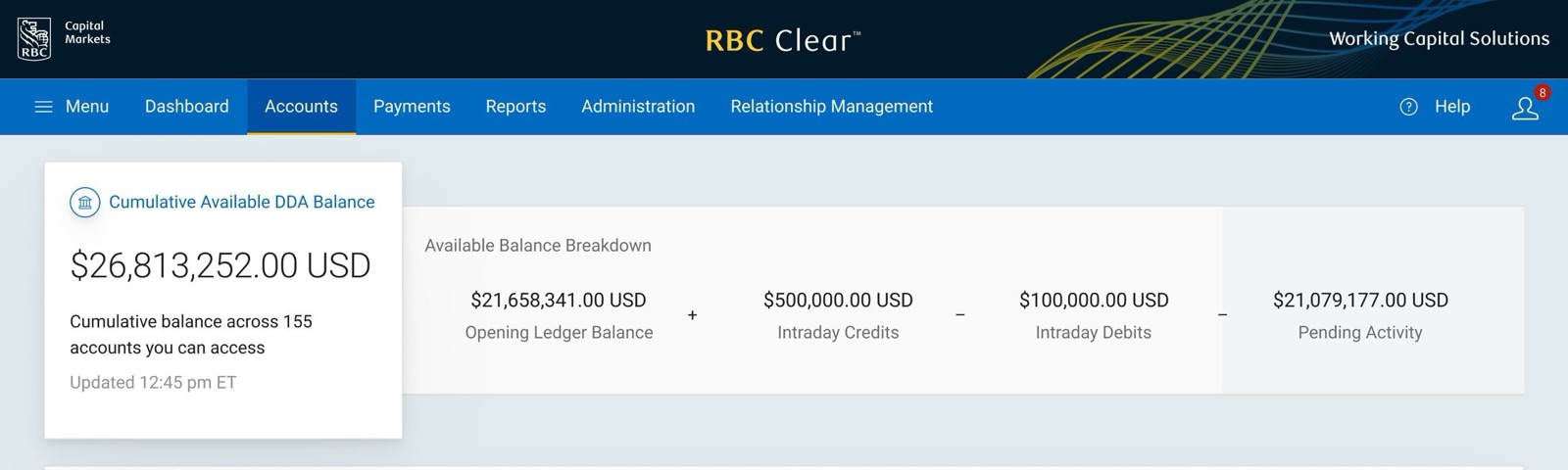
In 2023, I joined the Royal Bank of Canada engagement as a consultant leading UX design strategy for an ambitious project called RBC Clear, which entailed designing and building an entirely new application from the ground up.
The design team for this engagement was small, but when I joined, they had already developed an initial design system with several pages. With my technical background, I owned both the Accounts section and the Developer Portal. The first focused on a suite of experiences that enabled CFOs at large enterprise companies to manage all their accounts in one place, while the latter provided a space for CTOs and developers to access APIs for implementation into their own products. Both spaces had very specific user needs with little overlap between the two.
Within this case study, I will walk through the end-to-end process we developed, as well as the journey we went on, leading to the launch of the app and the awards it won as a result.
Redefining the design process
One of the challenges the team was facing when I first joined the project was a misalignment between product management and design. This often meant that new requirements were only identified at the approval stage rather than during discovery, forcing designs to be reworked late in the process. After investigating further, I identified that one of the root causes of this issue was a lack of standardization in the end-to-end process from business requirements to design to development, in addition to an unclear understanding of how product management and design work together.
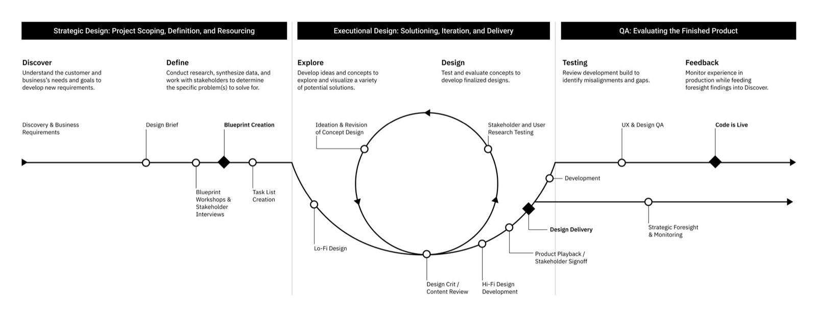
To alleviate the issue, increase team efficiency, and improve collaboration with stakeholders, I developed a standardized process that plugged into the already established service design approach. This new process involved:
- Workshop sessions with key stakeholders, led by designers, to develop a complete product Service Design Blueprint.
- Blueprint reviews where designers and product managers together identify user tasks and add them to a task list.
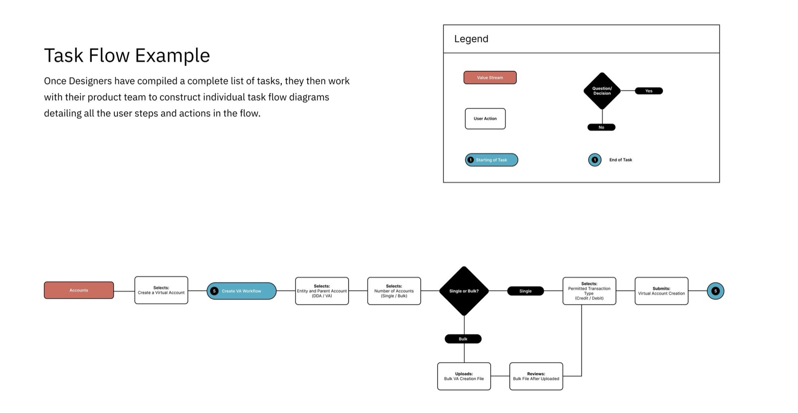
- Task mapping where the designer turns the identified tasks into Task Flow Diagrams, which are then verified with stakeholders.
- Low-fidelity designs built from the diagrams to receive approval from executive leadership before creating and delivering the high-fidelity designs.
Task Flow and low-fidelity development
Developing a task flow template and standardization process was imperative to correcting these challenges. The task flows made it easy for stakeholders both familiar and unfamiliar with the workstream to understand the intent of the design while making it quick and simple to rework in real time. The task flows were used through all levels of approval before moving into low-fidelity design development. Below is a shortened example of what a task flow looked like, in addition to its individual components.
Following the approval of a task flow, designers would then work on the low-fidelity screens using the lo-fi design system I built to simplify their design process. The goal was to focus the conversation on the specific parts of the design that needed attention and make the experience the centrepiece of the prototypes. This equipped designers to get feedback on the areas that were important for the experience.
Data visualization standardization
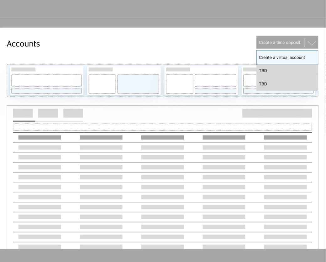
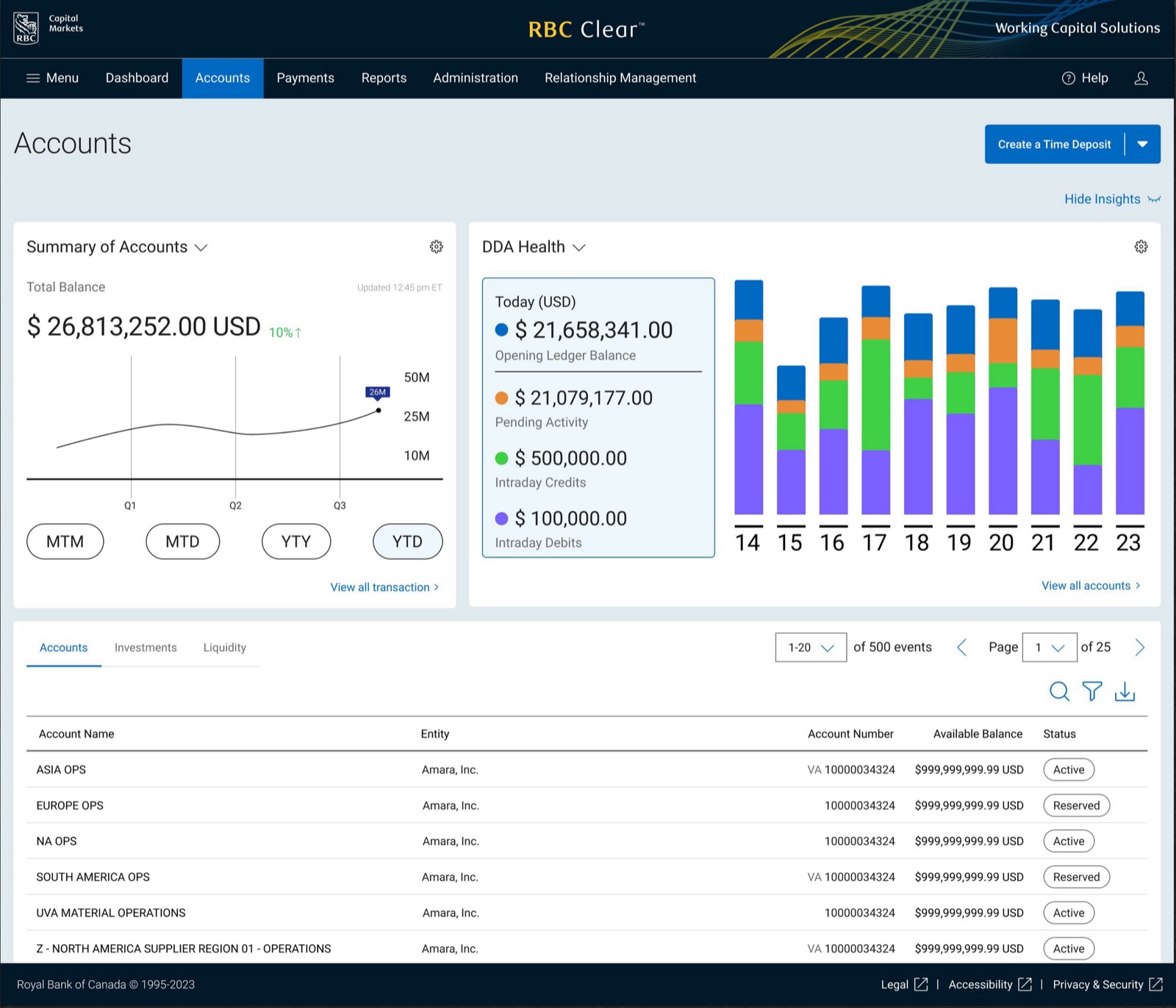
User testing surfaced a need for data visualization throughout key areas of the platform once the screens began to mature into their high-fidelity designs. To address this, we needed to develop a concept and standardized process, which led to the development of the Insight Card. Unlike the Data Widgets, which we proposed for future designs, Insight Cards are minimalist in nature, only providing the user with three key pieces of information: the title, the display area, and actionable recommendations.
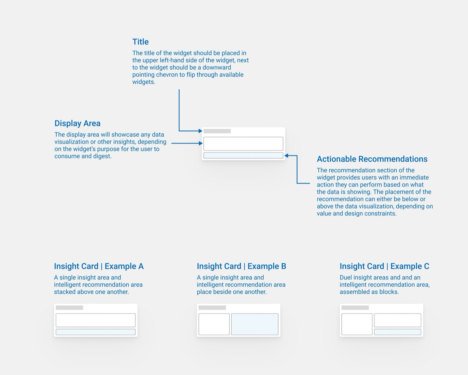
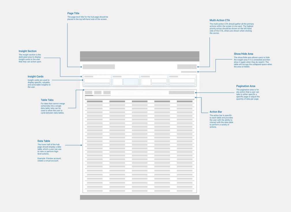
By limiting the Insight Cards to select details that were important to the user, we were able to easily incorporate them into all our main section pages with minimal impact on the existing layout designs. We also provided users with the ability to hide the entire insight section if they weren't currently using it.
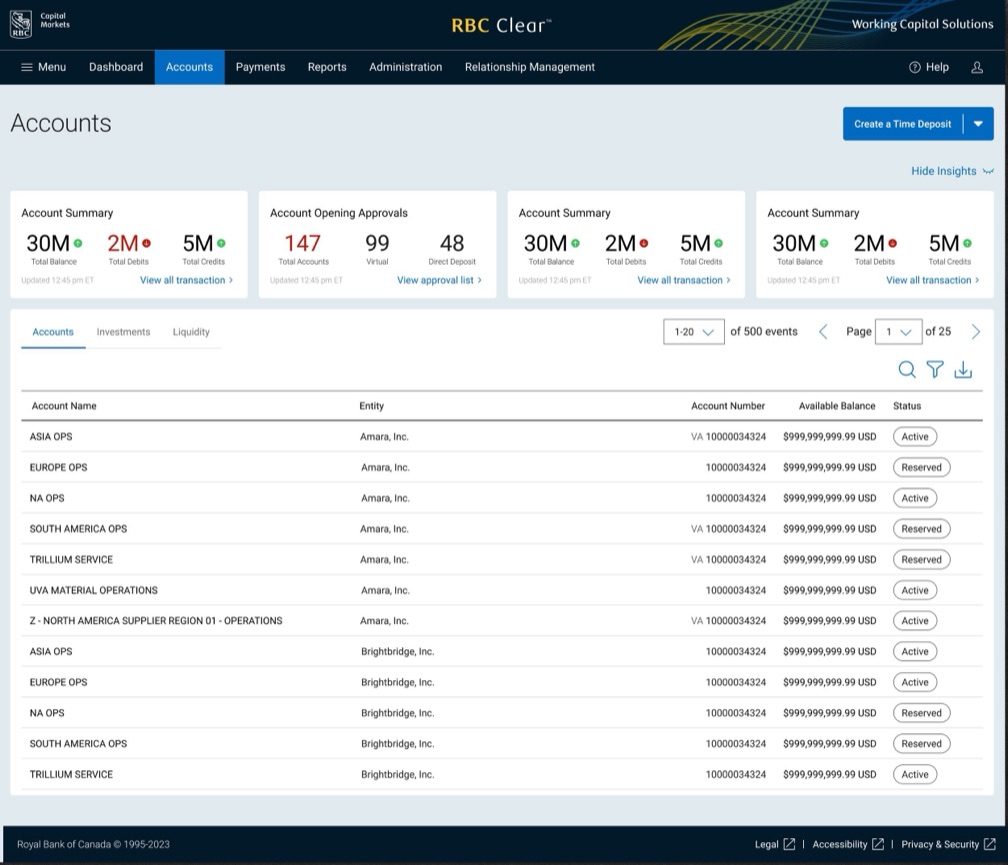
Below is an example with test data that we used to demonstrate the capabilities of the insight cards. This current design is the MVP version as we planned to later on introduce visualizations like miniature bar charts, line graphs, etc.
In addition to the Insight Cards, I developed the guidelines and concept designs for a future-looking implementation of Data Widgets. These widgets serve a different purpose than the Insight Cards, as they are meant to provide the user with a lot more information while giving them the ability to manipulate how the data is shown to match their needs. Unfortunately, due to development feasibility constraints at the time, the widgets were deferred until after launch, which was when I was assigned to a new client project. Below you can see a brief concept draft that was created during the exploration phase.
Impact
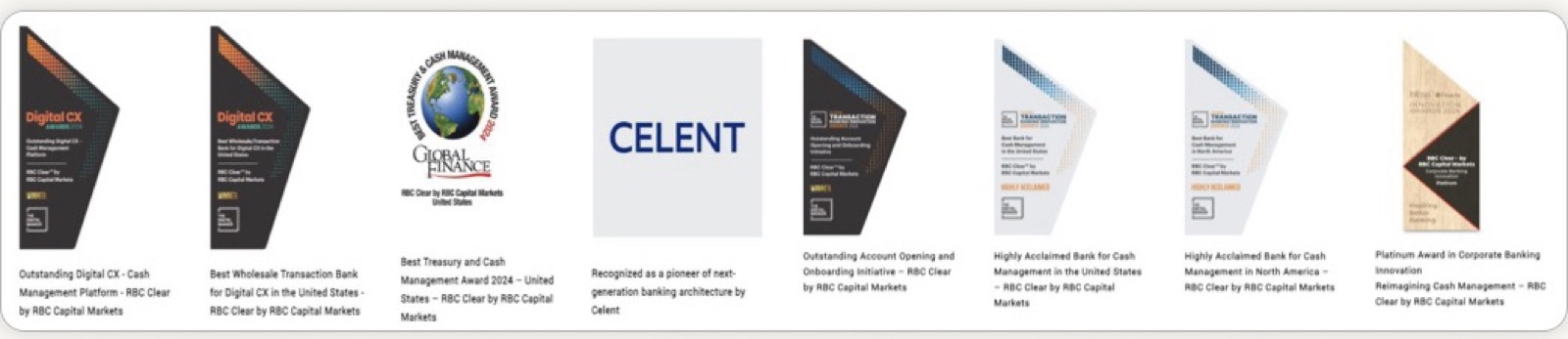
Overall, the RBC Clear project was a success for our client and our design team. The new cash management system won eight awards from The Digital Banker, Global Finance, and Infosys Finacle, including two Digital CX Awards for the platform's outstanding customer experience, and was recognized by Celent as a pioneer of next-generation banking architecture. Although the project ran into challenges at the beginning, by leveraging our collective skills and my standardized design processes, we were able to persevere and ultimately lead the product team in building an experience that customers find valuable for their businesses.